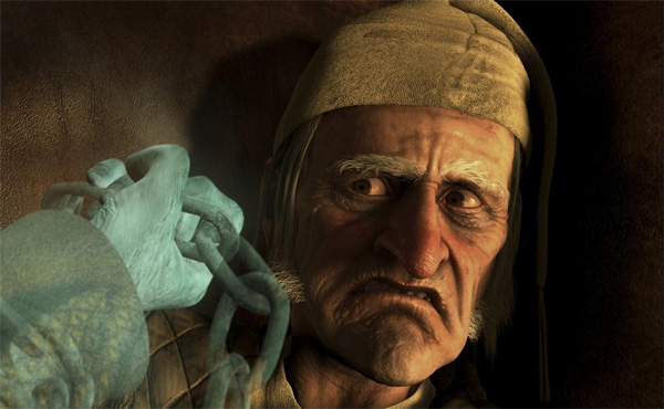
Through out my storyboard I hadn't put any consideration into the background of each scene. I know I wanted most of the scenes set indoors but I wasn't sure how I was going design this. My first thoughts were to have Balloon Boy live in a average looking family home.

Scene one starts of with Balloon Boy being inflated close to the camera. I wanted to keep him close because I thought it kept a little trepidation before the whole character was introduced. Next I wanted the character to look like he was opening his eyes for the first time. I liked the idea of him being born like Frankenstein's monster so I gave him a line like the one from the classic film.Once he says his line I wanted to give him a beaming smile. This would tell the audience straight away that he is a happy and cheerful character.
The scene was put together by using the control points, camera zoom and syncing the mouth by using the Morpher to match the sound that was loaded into the curve track editor.

The scene I created had a back wall with wallpaper, a lamp and a silly picture on the wall. I wasn't to sure if I liked the décor or if it would look better without these items. What I needed to do was a bit to research into backgrounds. After looking on you tube for a short while I realised that a lot of short animations kept the backgrounds blank. This emphasized the characters within the scene better.

Above is the background style I am going to keep throughout my film. Because the module is focusing of the character it would be wise to leave out needless parts of the environment. The background was created by adding a blurred picture into the environment background parameter.

No comments:
Post a Comment